How to Design a Billboard Ad That Actually Works (2026 Guide)
Key Takeaways
- Design for a 3-second read: one message, one focal point, one CTA.
- Cap copy at 5 words for the hook, 6 for the benefit, 4 for the CTA.
- Minimum 72px type, single bold sans-serif, maximum contrast.
- Build to the screen's native resolution and aspect ratio, not print.
- Show your brand from frame one; the loop never waits for a reveal.
Most billboard ads fail for the same reason: they try to say too much. A driver gets 2–3 seconds to read your screen. Design for that constraint and your campaign works harder for every pound you spend.
This is the playbook we use at Affinity Media for every brief that comes through our billboard ad design service, distilled into the rules you can apply yourself.
The 3-second rule
If a passer-by can't understand your ad in three seconds, it isn't a billboard ad. It's a poster they'll never get close enough to read. Before anything else, lock in three things:
- One message. One offer, one idea, one feeling. If you need an "and", cut it.
- One visual focal point. The eye should know exactly where to land first.
- One call to action. A URL, a phone number, or a brand. Pick one.
1. Keep the copy brutally short
Six words is the working maximum for the headline. Our internal rule, refined across hundreds of DOOH campaigns, is:
- Hook: max 5 words
- Benefit line: max 6 words
- Call to action: max 4 words
"Save 30% on insurance. Switch today" works. "Discover how our award-winning team can help you save money on your home and car insurance" doesn't, no matter how true it is.
2. Make the type huge
For a typical roadside digital billboard viewed from 20–50 metres, your minimum legible type size is around 72px, and your headline should sit at 96–120px or larger. If your headline isn't the loudest thing on the screen, it isn't loud enough.
Stick to one typeface, two weights at most. Bold, condensed sans-serifs (think Helvetica Bold, Inter Black, Druk) outperform decorative fonts every time.
3. Contrast is non-negotiable
Digital billboards are seen in full sun, at night, through rain, and at speed. Use the highest contrast pairing you can defend on-brand:
- Dark background, bright type is usually the safest bet for digital LED screens.
- Avoid mid-tones for type (greys on greys, yellow on white); they vanish in daylight.
- Test by squinting at a thumbnail. If anything disappears, fix it.
4. One hero visual, not a collage
A single, well-lit product shot or a single human face beats a busy lifestyle scene every single time. If you must include a background image, darken or blur it heavily so the type stays the hero.
Avoid drop shadows on type over photography; they read as muddy at distance. Instead, place type on a solid colour block.
5. Design for the actual screen, not your laptop
The most common mistake we see: agencies design at print resolution, send a PDF, and the screen owner has to crop and rescale it. Always design to the screen's native pixel dimensions and aspect ratio. For our Stockport flagship that means a specific 16:9 LED canvas, and the same applies to whatever screen you're booking.
If you're not sure, ask your media owner for the creative specs before you start designing, not after.
6. Build for the loop, not the still
Digital out-of-home rotates. Your ad shares the screen with 5–10 others on a 10-second slot. That means:
- Your brand should be visible from frame 1, not revealed at the end.
- Animation should add emphasis, not delay comprehension.
- Never rely on audio. Most outdoor screens don't have it, and nobody is listening anyway.
7. Treat the CTA like a destination
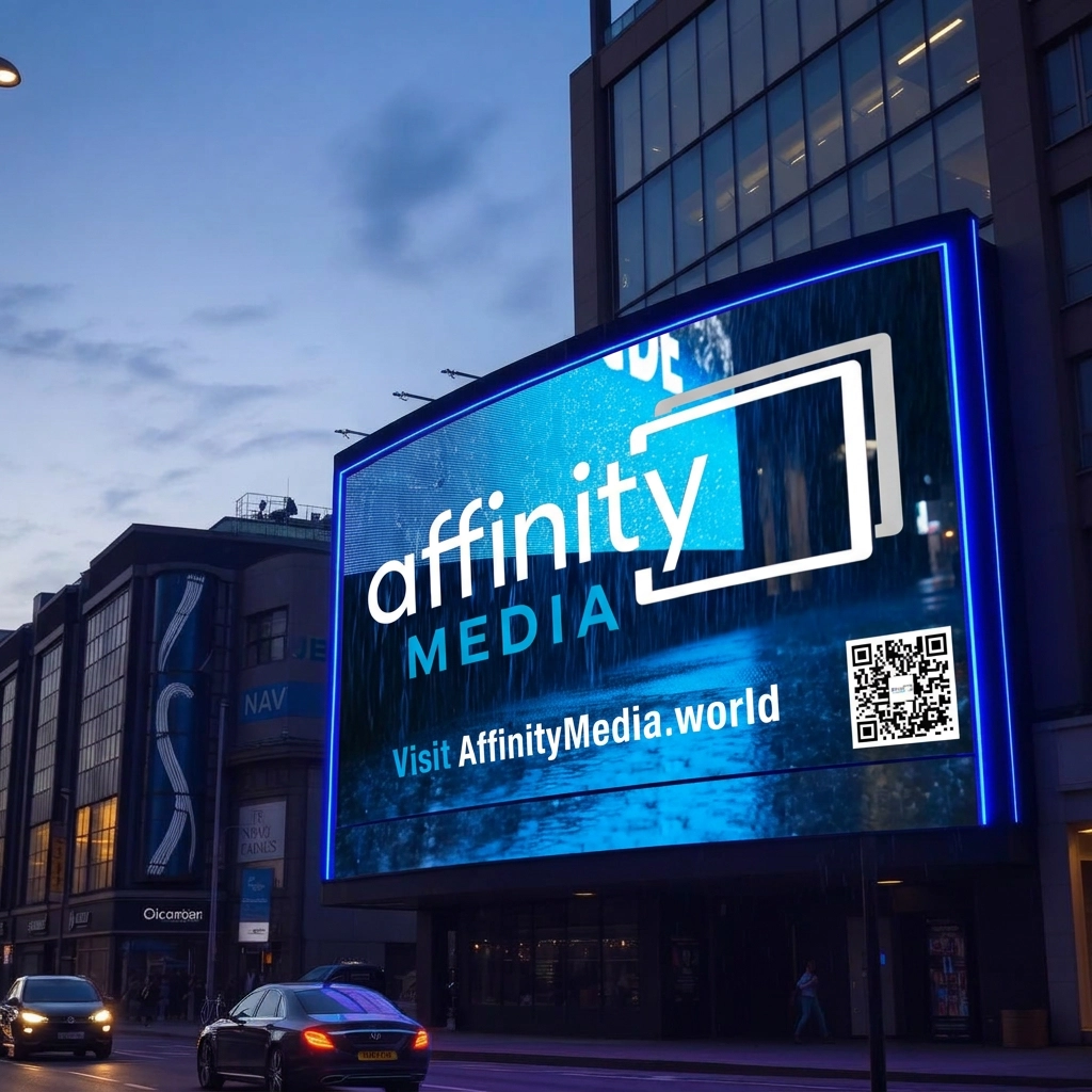
A URL on a billboard only works if it's memorable. affinitymedia.world works. brandname.com/campaigns/summer-2026/landing-page-v2 does not. Use a vanity domain, a short branded URL, or a QR code at minimum 20% of the canvas height. And yes, QR codes do work on DOOH when they're big enough.
The mistakes we fix every week
- Logo too small. If the brand is the message, the brand should be huge.
- Stock photography with watermarks or busy backgrounds. Cropping doesn't save it.
- Three CTAs. A website, a phone number, and a QR code is two too many.
- Designing in RGB with neon colours that won't display correctly on LED. Stick to colours within the screen's calibrated gamut.
- Sending artwork as a screenshot. Always supply high-quality MP4 or PNG at native resolution.
A simple checklist before you ship
- Can someone understand it in 3 seconds, from across the room, on a phone thumbnail?
- Is the headline 5 words or fewer?
- Is the brand visible the moment the ad appears?
- Is the type at least 72px, with a single bold typeface?
- Is the contrast strong enough to read in direct sunlight?
- Is the file at the screen's native resolution and aspect ratio?
- Is there exactly one call to action?
Want it done for you?
If you'd rather hand the brief to a team that designs for digital out-of-home every day, our billboard ad design service turns your brief into screen-ready artwork, typically within one week. Or, if you want to try generating your own first draft, our AI ad maker handles the heavy lifting on copy, layout and motion. For a wider view of how automated buying is changing outdoor advertising, see our guide to programmatic DOOH for small businesses.